Lampa przy wzorzystej ścianie. Jak połączyć oświetlenie z tapetą bez efektu chaosu?
-
Author
Izabela Seliga -
Date added
- 1273 views
Floral wallpaper, geometric patterns, tropical leaves or abstract motifs are often the main decorative feature of an interior, immediately drawing the eye as soon as you enter the room. The challenge arises when it comes to choosing the right lighting to go with it. Should the lamp blend into the background or, on the contrary, clearly stand out from it? Can you opt for a decorative lampshade against a patterned wall? Or is a minimalist fixture a better choice?
Well-chosen lighting can bring out the colours of the wallpaper, highlight its texture and give the pattern more depth. An ill-considered combination, on the other hand, can create visual chaos, even if both the wallpaper and the lamp look great on their own.
So how do you combine lighting with a statement wall to create a cohesive interior? Find out what to consider when choosing the colour, form and type of lamp.
Why does choosing the right lamp for patterned wallpaper matter so much?
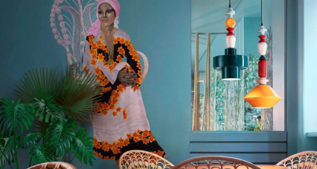
A patterned wall works differently in an interior than a plain surface. It attracts attention with colour, repeated motifs and contrasts. Even a subtle pattern becomes an additional element of the composition that needs to be taken into account when choosing the rest of the furnishings.
A lamp placed against such a wall no longer functions as a separate object. Its shape, colour, material and the way it emits light begin to interact with the wallpaper.
This is easiest to see with wall lamps. A simple black fixture against light wallpaper with small flowers can create a bold, graphic accent. The same wall lamp mounted on dark wallpaper with large, contrasting leaves may almost disappear into the composition.
The same applies to the form of the lamp itself. A decorative shade with lots of detailing combined with an intense pattern may cause the two elements to compete with each other. A minimalist fixture, on the other hand, allows the wallpaper to take centre stage.
That is why it is worth starting your lighting choice with one simple question: what should catch the eye first – the wallpaper or the lamp?
How to choose the colour of a lamp for patterned wallpaper?
Colour is one of the easiest ways to connect a lamp with a statement wall. This does not mean, however, that the fixture has to be exactly the same shade as the wallpaper. Sometimes a subtle reference to one of the colours in the pattern creates a much more interesting effect.
A lamp in a colour featured in the wallpaper
If the wallpaper combines several colours, choose one of them and repeat it in the lighting.
On a wall with green leaves and a beige background, you could introduce an olive lamp. With wallpaper in shades of burgundy, pink and cream, a burgundy fixture or one in powder pink will work beautifully. With geometric patterns in navy blue and mustard, you can choose a lamp in one of these shades.
This approach ensures that interior lighting does not look like a random addition. It becomes part of a larger colour composition, even if its form is completely different from the motifs on the wallpaper.
It is worth choosing a colour that actually appears in the pattern, but does not necessarily dominate it. The lamp can then bring out a less obvious shade and give the entire interior a more interesting character.
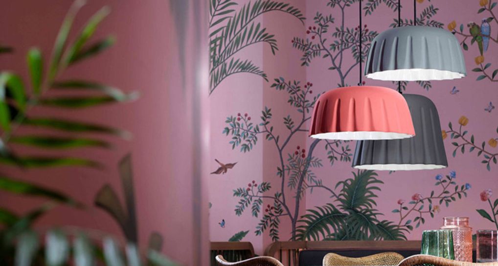
A neutral lamp against an intense pattern
If the wallpaper is very colourful, features large motifs or strong contrasts, a neutral fixture will be the best solution.
White, black, beige, ecru or matte metal help bring visual order to the composition. They work particularly well when the pattern itself is already decorative enough.
A white lamp with an opal glass shade can stand out gently against a colourful wall without introducing another intense hue. A black fixture, on the other hand, can emphasise the graphic character of the wallpaper, especially if black also appears in its outlines.
Remember, however, that a neutral colour does not always mean an unobtrusive lamp. A large white globe against dark wallpaper will still be a strong accent. That is why, in addition to colour, you should also consider the size and shape of the fixture.
Patterned wallpaper and lamp shape – how to maintain the right proportions?
With a statement wall, not only the colour but also the form of the lighting matters. Two lamps in exactly the same shade can create completely different effects depending on the shape of the lampshade.
The easiest approach is to follow the principle of balance. The more elaborate the wallpaper pattern, the calmer the form of the lamp can be.
Wallpaper with large flowers, leaves or organic motifs works beautifully with fixtures featuring simple, rounded shapes. An opal glass globe, a small cone or a minimalist wall lamp will not introduce unnecessary visual competition.
With small, regular patterns, on the other hand, you can opt for a more decorative lamp. Wallpaper with delicate stripes or small geometric motifs can provide an interesting backdrop for a larger fixture with an unusual form.
And what about mixing patterns? You do not have to give it up completely!
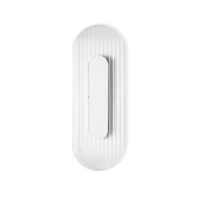
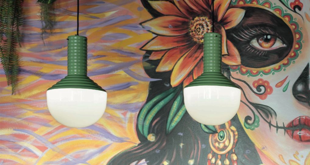
A lamp with ribbed glass (such as RIFLO by UMMO Lighting) can work well with wallpaper featuring vertical stripes, while a ceramic shade with a wavy surface can echo organic motifs. The key is to make sure the decorative elements share a common character rather than creating several independent compositions.
How does the lamp material affect the appearance of a patterned wall?
When choosing a lamp, it is also worth considering the material it is made from. To a large extent, it determines how the fixture looks against the wallpaper and how the light spreads throughout the room.
Opal glass is one of the most versatile solutions for patterned walls. It diffuses light, reduces the visibility of the bulb and creates a soft, even glow. As a result, the fixture itself does not introduce an excess of additional reflections.
Matte metal looks particularly good against wallpaper with intense colours and strong outlines. The simple, uniform surface of the lamp creates a visual counterpoint to the pattern. Depending on the construction of the shade, it can also direct light towards a specific area, such as a bedside table or worktop.
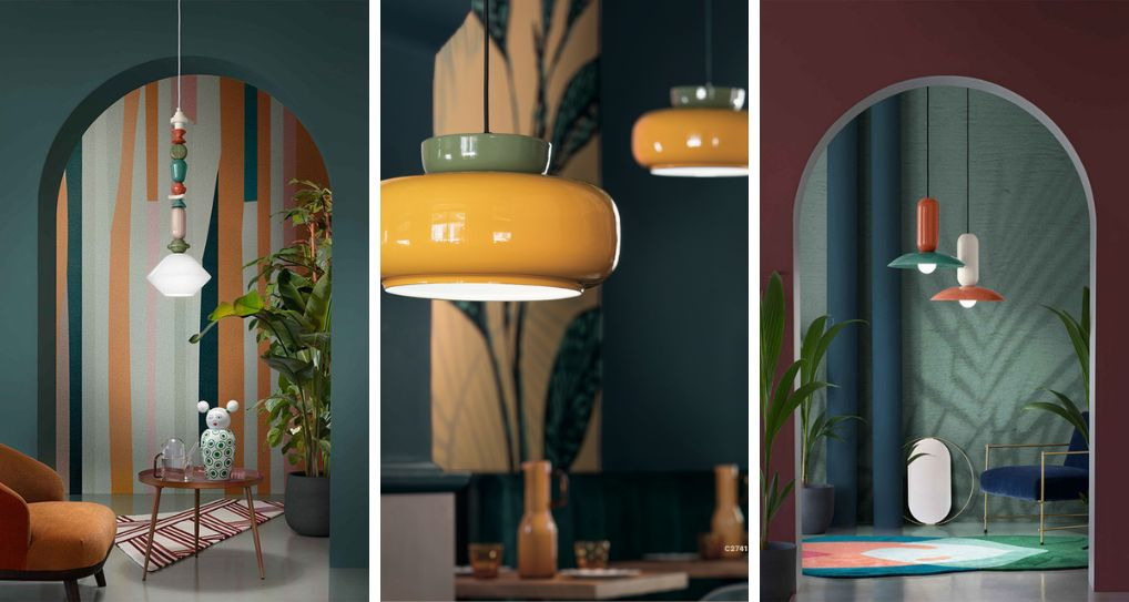
Ceramics and porcelain introduce a more decorative character without necessarily overwhelming the composition. They look particularly interesting when paired with botanical, retro and nature-inspired wallpapers.
Transparent glass creates a lighter visual effect because it does not completely obscure the background. Remember, however, that the visible bulb inside becomes another decorative element. With very intense wallpaper, it is therefore worth choosing a light source with a simple form.
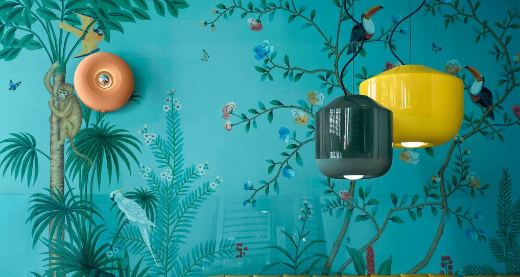
How to light a patterned wall to highlight the wallpaper?
Choosing the fixture is only half the story. Where you direct the light is equally important.
With patterned wallpaper, the aim is not always to illuminate the entire surface as brightly as possible. Sometimes a better effect can be achieved by subtly highlighting a selected section of the wall or using indirect light.
Even illumination of the wallpaper
If you want to showcase the entire pattern, consider illuminating the wall evenly, creating an effect similar to wallwashing*.
You can achieve this with appropriately positioned spotlights, a track lighting system or fixtures with a wide beam angle. This solution brings out the colours of the wallpaper without creating random, strongly illuminated spots.
It works particularly well on a wall behind a sofa, in a dining room or hallway, where the wallpaper serves as the main decorative feature.
*Wallwashing – a lighting technique that evenly illuminates a larger section of a wall, helping to reduce strong contrasts and highlight its colour or finish
Side lighting and wall lamps
Wall lamps mounted directly on the wallpaper allow you to create a more decorative effect. Depending on their construction, they can direct light upwards, downwards or in both directions at the same time. This type of lighting highlights a selected section of the wall and creates atmosphere, especially in the evening.
However, it is worth being careful with lamps that create very sharp, decorative beams of light. Against intense geometric wallpaper, an additional pattern created by light can introduce unnecessary visual chaos.
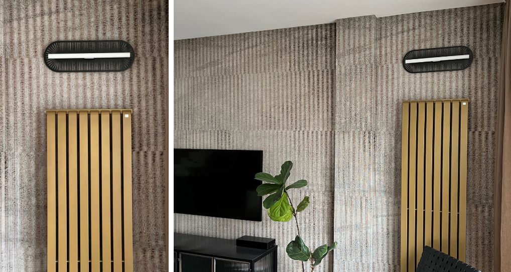
Lighting textured wallpaper
If the wallpaper has a pronounced texture, light falling at a slight angle can make its structure more visible. This effect works well with surfaces that imitate fabric, natural fibres or other three-dimensional materials.
Remember, however, that side lighting will also emphasise any imperfections in the wall. Before installation, it is worth checking the effect in the intended location, especially if the wallpaper has a glossy or metallic finish.
What colour temperature works best with patterned wallpaper?
Colour temperature affects how we perceive the colours of wallpaper after dark. The same pattern can look completely different in warm and neutral light.
In the living room, bedroom and dining room, a good starting point is light with a colour temperature of around 2700–3000 K. Warm light creates a cosy atmosphere and works well with wallpaper in shades of beige, brown, terracotta, burgundy or olive green.
With wallpaper based on cooler colours such as blue, grey or navy, you can also use warm light. However, if you want a more neutral effect, consider light sources with a colour temperature of around 3000–4000 K, especially in functional spaces. It is important for the colour temperature to be consistent with the rest of the lighting in the room
Also pay attention to the CRI colour rendering index. With colourful wallpaper, it is worth choosing light sources with a high CRI, preferably at least 90. This will make colours and subtle tonal transitions appear more natural.
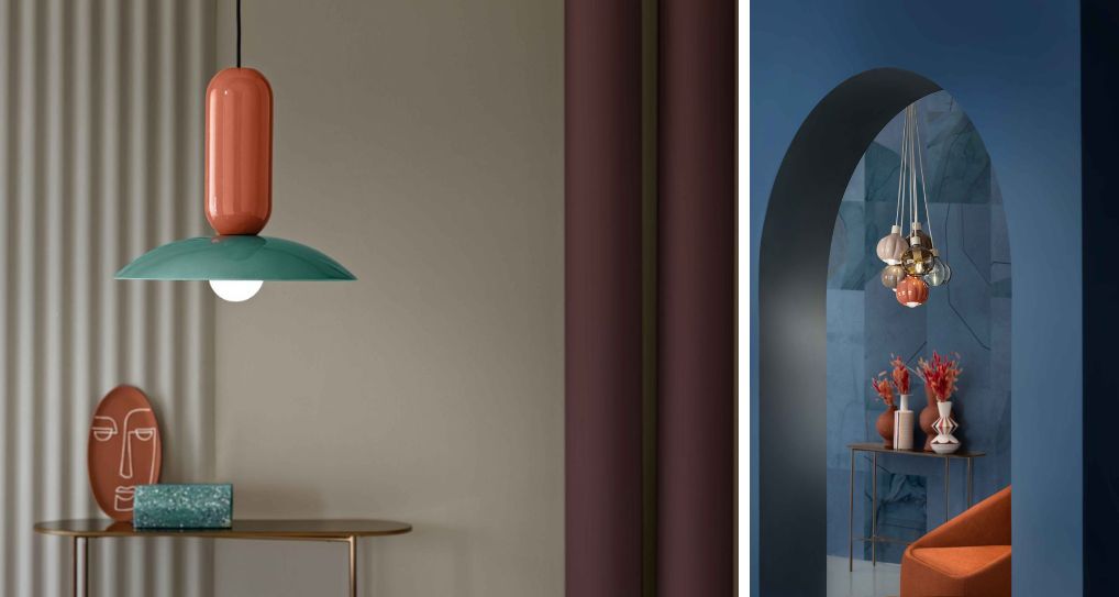
Which lamps should you choose for an interior with patterned wallpaper? Kolorowe Kable inspirations
A patterned wall does not mean you have to give up decorative lighting. It all depends on how intense the pattern is, which colours appear in the wallpaper and what effect you want to achieve. Take a look at a few ideas for combining specific lamp models with different types of wallpaper.
Geometric wallpaper – simple forms and bold outlines
With wallpaper featuring stripes, diamonds, arches or regular shapes, fixtures with a clear geometric form work particularly well. They do not have to replicate the pattern on the wall – it is enough for them to complement its graphic character.
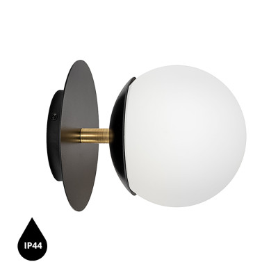
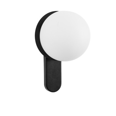
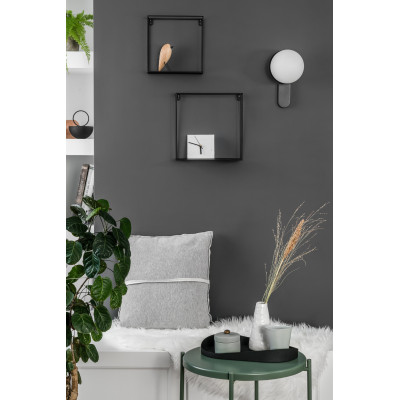
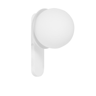
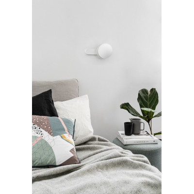
A good example is the KUUL D wall lamp by UMMO Lighting. A white opal glass globe on a black mount creates a simple composition that can provide an interesting contrast to geometric wallpaper. If the pattern is very intense, consider the version with a white mount, which will appear less prominent against a light background.
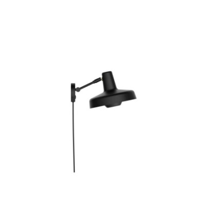
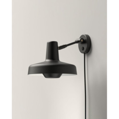
For more contrasting wallpaper, the black ARIGATO WALL wall lamp by Grupa Products is another good choice. Its adjustable design allows you to direct the light where it is needed, for example towards a table, rather than additionally highlighting the entire patterned wall.
Botanical wallpaper – greenery and natural details
Wallpaper featuring leaves, branches or tropical vegetation practically calls for lighting that references the colours of nature.
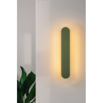
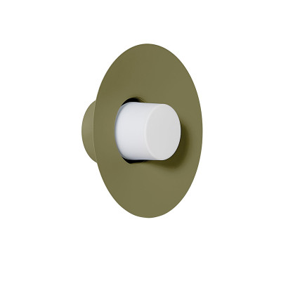
Against large green leaves, the olive CAPONIO wall lamp by UMMO Lighting can look particularly striking. Its colour can echo the botanical pattern, while the opal glass and metal shade with its distinctive hat-like shape add an interesting retro accent to the composition.
If the wallpaper is a little more subtle, you can opt for more decorative lighting. The dark green Loft Bala wall lamp by Kolorowe Kable combines metal elements, wooden beads and a braided cable. The natural wood works beautifully with botanical motifs, while the green lamp holder allows you to repeat one of the shades featured on the wall.
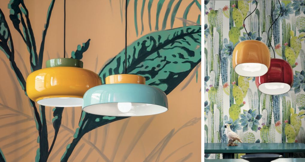
Wallpaper with small flowers and retro patterns – ceramics and decorative shapes
Wallpaper inspired by vintage style, delicate flowers and classic ornaments pairs particularly well with lamps that have a slightly more decorative character.
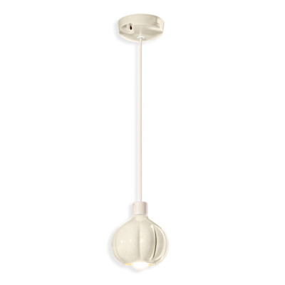
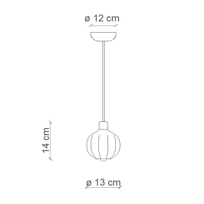
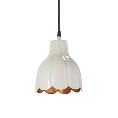
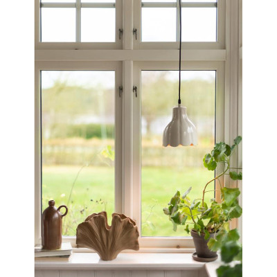
An interesting choice is the AFOXÈ Cream ceramic pendant lamp by Ferroluce. The cream shade with its distinctive three-dimensional form can complement wallpaper in shades of beige, powder pink or muted green. It introduces a decorative element without adding another strong colour.
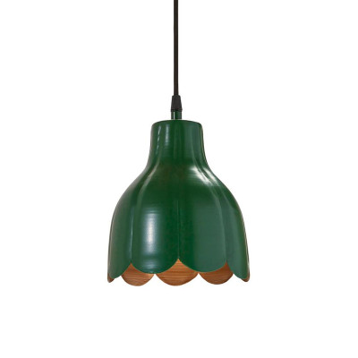
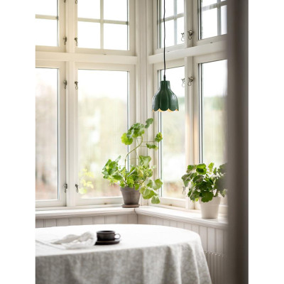
Another option is the Tulippa Carl Larsson lamps by PR Home. Their form resembles a flower, making them a natural fit for interiors inspired by nature and retro aesthetics. You can pair the green version with wallpaper featuring small botanical motifs, while the beige option can be used against a more colourful background.
In this type of arrangement, it is worth maintaining the right proportions. The larger and more contrasting the flowers on the wallpaper, the fewer additional decorative elements should appear around the lamp.
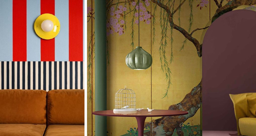
Art Deco wallpaper and patterns with metallic details – brass and opal glass
Wallpaper featuring geometric ornaments, gold lines or fan-shaped motifs often becomes the main decorative feature of an elegant living room or bedroom. In such interiors, it is worth referencing the metallic elements of the pattern.
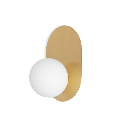
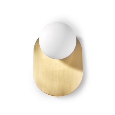
A good example is the HANEA brass wall lamp by UMMO Lighting. The gold base echoes the metallic accents in the wallpaper, while the opal glass shade balances the decorative character of the entire composition.
Another option is the black Zangra porcelain wall lamp with a brass detail. The simple fixture and exposed bulb create a stronger accent against wallpaper in navy blue, bottle green or burgundy.
Colourful abstract wallpaper – the lamp as part of the composition
With wallpaper featuring irregular patches of colour, wavy lines or abstract motifs, you can experiment with bolder combinations.
Instead of looking for a neutral fixture, choose a colour that appears in the wallpaper and repeat it in the lamp. The melon SUPURU W wall lamp by UMMO Lighting can echo orange and peach accents while introducing a more structured geometric form.
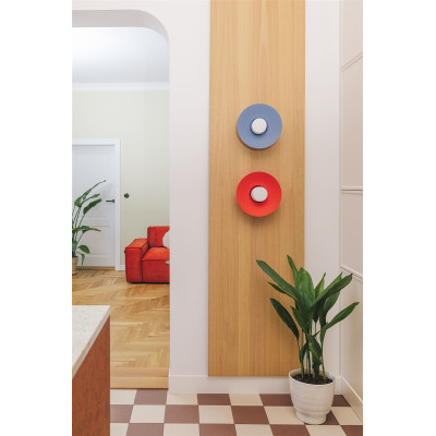
Another interesting solution is the PLAAT C wall lamp with a red-orange mount and white glass globe. The intense colour of the frame can correspond with a selected area of the wallpaper, while the opal glass shade helps maintain a balance between the decorative character of the fixture and the pattern on the wall.
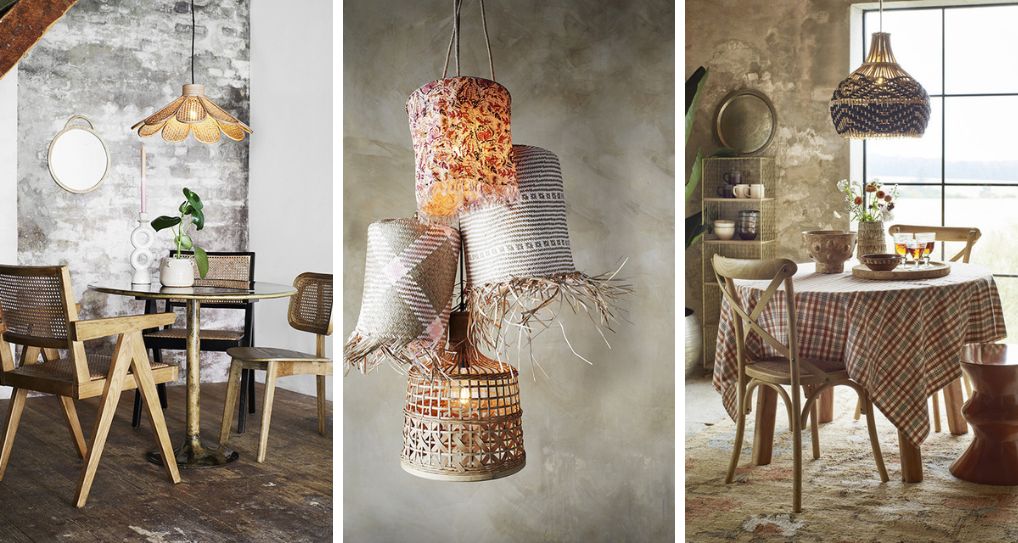
Boho wallpaper and nature-inspired motifs – wood and rattan
Wallpaper in shades of sand, caramel, olive or terracotta works well with lighting made from natural materials.
It is worth considering the ROKKE WOOD wall lamp by UMMO Lighting. Its wooden form and decorative element can complement wallpaper featuring delicate leaves, organic lines or patterns inspired by natural structures.
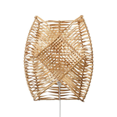
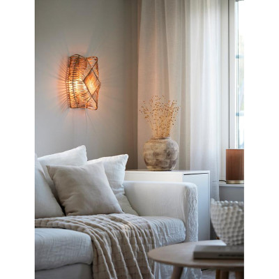
With larger, more sparsely arranged motifs, you can also choose the Zyla rattan wall lamp by PR Home. Its woven form introduces additional texture, so it works best where the wallpaper leaves a little more visual breathing room around the lamp.
Lamps with braided cables – match the details too
With a patterned wall, do not forget about the cables! Especially if you choose a wall lamp with a visible cable or a pendant lamp with a longer suspension.
At Kolorowe Kable, you will find braided cables in a wide range of colours that you can match to the wallpaper, lampshade or other elements of the interior.
A beige cable can subtly blend into light wallpaper, a black one can emphasise its geometric character, while olive or burgundy can reference one of the colours in the pattern.
Such a detail can connect the lamp with the wall without the need to introduce additional decorative elements.
The most common mistakes when combining a lamp with wallpaper
Even elements that look good individually can create an incohesive composition when combined. That is why, before buying lighting, it is worth paying attention to a few of the most common mistakes.
- Combining too many decorative elements – intense wallpaper, a patterned lampshade, a colourful cable and a decorative bulb can look too heavy together. Decide which element should attract the most attention.
- Choosing a lamp based solely on one colour in the wallpaper – colour is important, but the size of the pattern, its character and level of contrast also matter. A lamp may match the wallpaper in terms of colour and still disrupt the proportions of the entire wall.
- Too many wall lamps in a small area – several fixtures placed close together can obscure the pattern and make the decorative wall feel visually overloaded.
- Poorly considered light direction – sharp beams and strong contrasts can compete with the motifs on the wallpaper. If the pattern is very intense, consider more even illumination.
- Ignoring the sheen of the wallpaper – metallic and glossy surfaces can create pronounced reflections. Before installation, check whether the light reflects in a way that causes discomfort.
- Mismatched colour temperature – a poorly chosen bulb can alter the appearance of the wallpaper colours and make the entire interior look different than it does in daylight.
- Failing to consider the entire composition – the wallpaper and lamp should also work with the furniture, textiles and other lighting in the room. Do not choose a wall lamp based solely on a photo of the wall itself.
How to combine a lamp with wallpaper? Summary
A patterned wall does not mean you have to give up decorative lighting. What matters is maintaining the right balance between colour, the form of the lamp and the light itself.
With intense wallpaper, simple fixtures, opal glass and more understated finishes work best. With subtler patterns, you can opt for more expressive lamps, colourful shades or decorative details. Also remember the direction of the light, which can either highlight the wallpaper or unnecessarily introduce additional contrasts.
If you are looking for lighting for an interior with a patterned wall, explore the KoloroweKable.pl range. You will find wall lamps, pendant lamps, ceramic fixtures, opal glass models and braided cables that will help you create a cohesive arrangement tailored to the character of your wallpaper.
Related products

Rattan boho wall lamp Zyla 36 cm PR HOME